TLDR – Redundancy & Inception
When it comes to the subject of the actual text we use in Facebook Ads, I frequently battle against my own clients’ preconceived notions about what needs to be there and what can be cut.
After all, as a board game publisher, one of their primary roles is to cut excess fluff so the fun shines through, free of any element that detracts from the core experience.
While you want to eliminate distraction from your end user in a board game, the primary goal of an ad is distraction of the end user.
I need to distract you from your browsing of Facebook or wherever else with my ad. I want you to stop what you’re doing and read my ad, then click on my ad, then sign up for the email list, and on it goes as you fall deeper into my evil clutches when you spend $90 on my client’s latest Kickstarter project!
The image/video’s purpose is what I call the SHINY ROCK philosophy — also known as something that grabs your attention — but it is the ad text that combines with the creative image to generate interest in your mind as to what more lay behind that link.
(If you need some examples of Facebook ads that converted well, I recently wrote an article showcasing some of my clients’ top performing Facebook ads[Link Here]) Let’s get into these two elements, and why they are so important to your success!
Redundancy
Redundancy is when you repeat yourself, and it is important to repeat yourself.
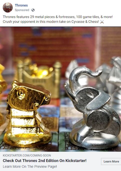
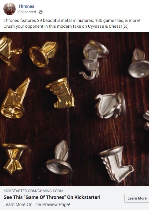
Let me illustrate with an example of a recent client’s ad (on the left).
In case you don’t see the redundancies, here are the things that are repeated multiple times: The “Call to Action” 4x– 3 different calls, repeated 4 times total (Crush your opponent, Check Out Thrones, Learn More x2)
The Game’s Name 3x
– Thrones is repeated 3 times (the advertiser name at the top, the primary text above the image, and the headline below the image)
Kickstarter 2x
– Kickstarter is repeated 2x (the vanity URL and the headline)
Why is redundancy important?
Redundancy is when you repeat yourself, and it is important to repeat yourself.
If you fail to repeat yourself, I might miss your call to action, your game’s name, or other important details that are important for part 2…
When a user reads the text that surrounds this glorious image, it provides important context to the image and creates interest in what lay beyond the click of the mouse.
It might be interesting, but sometimes I don’t have time to indulge that interest right now. Other times, I see an interesting ad, but I miss the very bold “Learn More” button (because I’m very busy spying on my Facebook friends and lurking in my Facebook groups).
The only chance you have of me remembering you without paying more for me to see your ad again is through a clever use of redundancy. The difference between an ad that uses redundancies can be as much as a 50% lower cost per click (from $0.30 to $0.20 for example). That number is a massive boost to your effective budget in your ad. That number means you create 50% more money out of thin air that you get to spend on ads. Don’t neglect redundancy. Don’t neglect redundancy.
Inception
Inception is when you tell your audience what they should think about a particular topic.
This term is a reference to that epic movie starring Leonardo Dicaprio, where he enters the subconscious mind to plant an idea that his “victim” will later agree with or act upon in a favorable manner.
Let me illustrate with a slightly altered example of that same ad from before (on the left).
There is only one subtle use of “inception” in this ad. Can you find it?
If you thought it was the on-the-nose “Game of Thrones” reference, you missed it!
The only use of this concept is the term “beautiful.”
Why is Inception important?
Beauty, as they say, is in the eye of the beholder. My reader is beholding my ad, so… (I know what you’re probably thinking — “I disagree!” Hold that objection for now, and let me address that later)
The phenomenon of “groupthink” is so powerful. We will agree with something if an influencer or group of peers agrees, as long as that thing isn’t against our fundamental beliefs. Often times, we are actively forming opinions about new things.
You need to help your audience form the right opinion! But be careful, because you can utterly botch this — it’s time to address the reader’s objection of… “I disagree.”
You might be disagreeing with my ad, because I went to great lengths to point out my attempt at inception to you. After all, I wrote an entire blog post on this and you’re reading it.
(…this is a great blog post that you want to share, by the way…)
If you’re still with me, pay attention to this: People like to disagree.
If you say something that can be argued with, you’re going to get argued with.
Most of the time, the objection may never come out in a comment. The objection will happen in the mind of the reader, and they will stop reading your ad.
Therefore, it is important to make statements that people should agree with, stopping just short of things that you *want* them to agree with…
…regardless of if the statement in question is true or not.
Several game-specific examples of things I disagree with all the time (whether or not they’re true):
“…a revolutionary/incredible/amazing/epic game…”
“…new mechanics…”
“…infinite replayability…”
90% of this can be summed up in the following statement: Be careful of the adjectives you use, but a creative use of descriptive words will improve your ad performance!
Conclusion
I hope you enjoyed this article! Please leave a comment with your #1 takeaway, and feel free to ask a follow-up question! Chances are that if you would benefit from the answer, others would as well.
If you’re looking for a marketing guy for your next Kickstarter project, view our Kickstarter Marketing page for details.


